Your UK net worth, tax and retirement plan in one place.
Free forever · No bank linking · No credit card · Not regulated financial advice
Quietly trusted by 100+ self-directed UK investors — built solo from Edinburgh, no VC, no ads, no affiliate links.
£0
To get started
2 min
To set up
0
Ads. Ever.
No
Bank linking
Here's what you'll see inside ↓
wealthr.co.uk
What's inside
Everything a UK investor needs. One clean view.
Net worth tracking, smart UK-aware forecasts with Monte Carlo, a full UK tax calculator with the Pro Tax Year Optimiser, the Pro Scenarios life-event simulator, ISA & SIPP coverage, dividend, property & physical-asset tracking, financial stress test — and a free retirement income tracker for anyone already in decumulation.
📈
Net worth tracking
Records, clean charts, plain-English insights. Know your number every month — not just when you open a spreadsheet.
🇬🇧
See where you stand New
How does your net worth compare to the UK for your age? A clean percentile scale benchmarks you against the ONS Wealth & Assets Survey — bottom to top 10%, with the median and quartile thresholds for your age band. Follows your Household or You view. Early in the journey? It shows the milestones ahead instead of a rank.
👫
Household & partner planning New
Plan as a couple, not two spreadsheets. Mark any investment, property or debt as part-owned, name who owns the rest, then switch between Household, You and your partner's share across net worth, forecasts and tax. Joint income, both pensions, both State Pensions and combined take-home in one shared view — with an ownership breakdown of who owns what. Friend or family co-owners stay out of your total.
🔮
Smart forecasts
Three-scenario projections with live sliders, plus a Monte Carlo simulator that runs thousands of market paths to show the odds your money lasts. Add purchase prices to unlock your real annualised return from day one.
💷
UK tax calculator Updated
Full 2026/27 tax year. Take-home, band-by-band, HICBC on the higher earner, Marriage Allowance, Child Benefit, Student Loan plans 1/2/4/5/PG, salary sacrifice, 60% taper. England, Wales, NI & Scotland.
📋
Pro Tax Year Optimiser New · Pro
Your data turned into a personalised UK tax-year action plan. HICBC escape, Marriage Allowance scanner with backdating, Move-into-ISA candidates ranked against your CGT allowance.
🔭
Scenarios — what if? New · Pro
£200/hr financial-planner answers, against your actual data. Model an income shock, the cost of raising a child, long-term care, a single-income transition, a car-on-finance decision, or the 2026–2031 UK Budget changes (pension-IHT, frozen nil-rate bands and more). Drag sliders, watch runway, FIRE-date delay and lifetime cost update live. Save scenarios with names and compare two side-by-side.
🪙
ISA allowance tracker New
All six UK ISA wrappers — Stocks & Shares, Cash, LISA, JISA, IFISA and legacy Help to Buy. Limits, contributions and remaining allowance per wrapper, with a built-in help guide.
🛡️
Financial stress test New
Model job loss, mortgage rate rises, childcare or a one-off cost against your real numbers. Runway in months, net worth impact over 5 years, monthly cash position under each scenario.
🏖️
Retirement & FIRE
Magic number, coast number, accumulation and drawdown charts. Plus a portfolio runway calc that answers "will my money last?" in plain years.
🏦
Pension planning
Workplace DC, SIPP, LISA, Defined Benefit — tracked separately, totalled together. State Pension projection from your NI qualifying years. Tax relief shown per pot.
🏛️
Estate & IHT planning New
Your inheritance tax position from the numbers already in your dashboard — free. Nil-rate and residence bands, spouse transferable allowances, the 36% charity rate, the April 2027 pension rule modelled both ways. Pro adds the planning suite: lifetime gifts with live 7-year countdowns, who-gets-what wishes (private by default), and what your family would receive if you died today.
🏠
Property & BTL
Value, equity, mortgage balance, BTL cashflow and gross yield. Toggle equity in or out of your net worth — fully dynamic.
💎
Physical assets & collectables
Track watches, art, classic cars, wine and precious metals alongside everything else — each with its own growth rate. See gains, holding costs, and how they fit into your total net worth.
💵
Dividend income horizon
Model reinvestment then income phases. See projected monthly passive income at any future age — with the UK £500/yr dividend allowance baked in.
🔗
Custom adviser share links Pro
Share a read-only link with your IFA, accountant or family — and choose exactly which sections they see. They can edit nothing. Revoke with one click.
📤
PDF reports Pro
Clean printable summaries of any section — net worth, investments, tax position or pensions. Useful for adviser meetings or mortgage applications.
🔒
Private. Always.
No bank linking. No ads. No data selling. Your financial life is yours — we just help you see it clearly.
🏖️ Built for retirees too · New
A free UK retirement income tracker — for people already past the FIRE date.
Most UK personal finance apps were built for accumulators. WealthR works just as well in decumulation. Add unlimited income streams — DB pensions, State Pension (with start date), SIPP drawdown, annuity, offshore bond 5% withdrawal, ISA withdrawals, GIA dividends, rental income — each with the correct UK tax treatment baked in. No NI on retirement income. Dividend allowance, Personal Savings Allowance and the £100k taper handled per stream.
📋
11 stream types, proper UK tax
State Pension, DB, SIPP drawdown (25% TFC + 75% taxable), annuity, offshore bond, ISA withdrawals, GIA dividends & interest, rental, other taxable, other tax-free.
📅
Start dates respected
State Pension kicks in at your SPA. Deferred annuity in 2030? The Forecast handles it — future income joins the runway calc when it activates.
⏳
Portfolio runway
"Will my money last?" gets an actual answer. Years until the pot is exhausted at your current burn rate — or "indefinite" if income covers spending.
💷
Real net take-home
NI removed. Dividend allowance and Personal Savings Allowance run as separate sub-calcs. Marginal rate shown alongside. The number you'd actually see in your bank.
A growing library of free UK calculators — no signup, no email gate. Many are built into the app too, but you can use any of them right now to model a single decision.
"Started using WealthR for pension modelling. You can enter a range of investments and debts to get a clear picture of your portfolio and risks — and quickly model how different changes might impact your outcome over time. Manual entry takes a bit longer but adds natural security by not linking your bank or pension accounts."
O
Mr Overton
★★★★★ · Verified Trustpilot review · UK
"A brilliant tool for giving me a clear picture of my financial position and how that sets me up for later in life. Genuinely insightful and easy to use — I'd highly recommend it to anyone curious about their financial position or looking to make progress toward their financial goals."
I
Iain Gilzean
★★★★★ · Verified Trustpilot review · UK
"Didn't think I'd need an app to visualise my future, but here I am. Great interface and easy to use — and the built-in guides explain things I didn't fully understand before. For a novice investor, it brings all my finances into one place. Tax calculator is cool!"
10+ years investing. None of my platforms showed me my future self.
Liam Kane
Founder · Edinburgh
I've spent the last decade building wealth slowly — ISAs, pensions, equity in my home, and a few physical assets like silver that should hold their value over time.
Every platform showed me what I had today. None showed me where I was heading.
For years I tracked it in a spreadsheet. The maths worked. The problem was me — I'd forget to update it for months, and the forecasts stopped reflecting reality.
So I built WealthR.
Two minutes a month. No bank linking, no ads, no selling your data. Built for the UK — because everything else is either platform-specific or an American app with a £ sign bolted on.
If you've ever tried to plan your retirement on a spreadsheet and watched it gather dust — WealthR is built for you.
Honest side-by-side reads on how WealthR fits next to the popular UK apps. Same questions, different answers — and sometimes the right move is to use both.
Yes — WealthR is free to use, forever, on the free tier. You get net worth tracking, FIRE calculations, the financial stress test, ISA and SIPP tracking, the full UK income tax calculator (2026/27 bands, Scottish rates, HICBC, Marriage Allowance), dividend planner, property tracker and 19 free UK calculators — no time limit, no credit card, no feature gating on the core experience. WealthR Pro (£4.99/month or £39.99/year) is an optional upgrade. No ads, no data selling, no bait-and-switch.
WealthR Free includes every core feature with no limit on accounts, investments, ISAs or SIPPs — net worth tracking, FIRE planning, three-scenario forecasts, the financial stress test, the UK income tax calculator with Scottish rates, the ISA allowance tracker for all six wrappers, dividend income planner and 19 free calculators. WealthR Pro (£4.99/month or £39.99/year, saving 33% annually) adds the Pro Tax Year Optimiser (HICBC escape, Marriage Allowance scanner, Bed-and-ISA candidates), PDF reports for every section, adviser share links, the actual-return forecast scenario, and full stress test scenario controls. One Pro subscription covers your whole household. A 7-day free trial is included.
Yes — WealthR has full household and partner planning. Mark any investment, property or debt as part-owned and name who owns the rest, then switch between a Household view, your own share, and your partner's share across net worth, forecasts and tax. Add your partner's pensions and State Pension for a combined retirement projection, see your household take-home (with Child Benefit and HICBC applied to the higher earner per HMRC rules), and an ownership breakdown shows exactly who owns what. Friend or family co-owners are kept out of your personal total, so the numbers stay honest. One Pro subscription covers your whole household.
No — WealthR is manual-entry by design. We don't use Open Banking, don't link to your bank, and don't read your transactions. You enter your own figures, which takes around two minutes a month to update. The benefit: no third-party reading your spending, no broken bank-feed errors every few weeks, no Open Banking permission renewals, and a stronger sense of what your money is actually doing. WealthR is built for planning your financial future, not categorising last week's coffees.
WealthR is privacy-first by design. There's no bank linking, no Open Banking, no third-party tracker scripts, and no ads. WealthR does not sell data to third parties and does not take money from financial providers, so there's no commercial incentive to push you toward any product. Your account is stored on Supabase (EU-hosted) with row-level security so only you can read your own data. The site enforces a strict Content Security Policy and only allows network traffic to our own servers — no third-party tracking pixels, no analytics platforms outside our own privacy-respecting custom build.
Yes — WealthR is a Progressive Web App with a service worker that caches the full app to your device on first load. Once installed, the app opens and works without an internet connection — you can view your dashboard, run calculations and update balances offline. The connection is only used to sync your latest balances when you go back online, to fetch live crypto prices, and to load fresh blog posts. Your local data is always available, even on a plane or with no signal.
Yes — WealthR works on iPhone and Android as a Progressive Web App (PWA). Visit wealthr.co.uk on your phone, tap the share button and select "Add to Home Screen" — it installs like a native app with full-screen view, icon and offline support. Dynamic Island and notch layouts are handled correctly. The dashboard is deliberately designed for serious planning sessions, so it's at its best on a desktop or laptop, but mobile is great for quick balance updates, viewing your net worth and using the 19 free UK calculators on the go.
WealthR is built specifically for UK investors and operates in GBP (£). All UK tax rules, ISA limits, pension allowances, State Pension projections, HICBC thresholds and Stamp Duty bands are modelled in pounds sterling. We don't support multi-currency portfolios. The product is deliberately UK-only — built by a UK founder in Edinburgh for the UK personal finance market, not a US app with a pound sign bolted on.
WealthR tracks stocks through manual entry of your portfolio balance (or per-holding if you prefer) so you can record positions across Stocks & Shares ISAs, SIPPs and General Investment Accounts. For crypto, live prices via CoinGecko are fetched on demand — you enter your holdings (BTC, ETH, etc.) and WealthR calculates current value in GBP automatically. Both stocks and crypto are aggregated into your overall net worth, with separate breakdowns by wrapper, dividend yield and category. There's no broker or exchange linking — your figures stay private.
Yes — cancel any time, no questions asked, no retention call, no minimum term. Cancellation takes effect at the end of your current billing period (you keep Pro access until that date). Your data stays intact when you downgrade — every account, investment, pension and historic balance is preserved on the free tier. The only things that revert are the Pro-only features (Tax Year Optimiser, PDF reports, adviser share links, actual-return scenario, full stress test controls and the 12-month-plus history). Re-upgrade any time and it all comes back.
Yes — WealthR Pro includes CSV export of your account data, monthly entries, investment positions and net worth history. Free users can request a full data export at any time via the Privacy page — under UK GDPR (Article 20, right to data portability) you're entitled to a copy of everything WealthR holds about you, delivered in machine-readable format. We don't currently support direct import from competitor apps because their data structures vary widely, but the export covers everything you'd need to move data elsewhere.
WealthR is a UK personal finance app built for investors and FIRE planners. Unlike budgeting apps that focus on day-to-day spending, or retirement calculators that answer just one question, WealthR gives you a complete breakdown of your wealth — investments, property equity, pensions, physical assets, crypto — with smart forecasts, a financial stress test for job loss, rate rises and life events, and realistic projections of where you're heading. No bank linking, no ads, no Open Banking required.
Six things, mostly — all of which a spreadsheet can technically do but rarely keeps doing because nobody maintains it that well. (1) Automatic forecasts that update the moment you change a balance — no formula edits, no broken cells. (2) UK tax baked in for 2026/27 — ISA, SIPP, HICBC, Marriage Allowance, the 60% taper between £100k–£125,140, Scottish bands. (3) Cross-device sync — log a balance on your phone, see it on desktop instantly. (4) Sequence-of-returns stress testing — what happens to retirement if markets drop 20% in year 1 while you keep drawing income. (5) Read-only adviser share links, so you never have to send an IFA your raw spreadsheet. (6) Annualised real return calculated automatically from your own data. You could build any of these in Excel. You won't maintain them for long.
WealthR's stress test lets you model how your plan holds up when life doesn't go to plan — job loss (adjustable 0–100% income reduction), mortgage rate rises, childcare costs, a wedding or one-off big cost. It shows your runway in months, your net worth impact over 5 years, and your monthly cash position under each scenario. Pro users get full scenario controls, a recurring cost builder, one-off cost planner and personalised £ fixes.
Yes — WealthR is built specifically for UK investors. It understands ISAs, SIPPs, LISAs, dividend allowances, NI qualifying years, State Pension projections, buy-to-let equity, and UK income tax bands. It is not a US app with a pound sign bolted on.
Yes. WealthR includes a free UK retirement income tracker — DB pensions, State Pension (with start date), SIPP drawdown (25% TFC + 75% taxable), annuity income, offshore bond 5% withdrawal, ISA withdrawals, GIA dividends, GIA interest, rental income — each with the correct UK tax treatment baked in. No National Insurance on retirement income. The dividend allowance, Personal Savings Allowance and the £100k personal allowance taper are handled per stream. The Forecast tab also gains a portfolio runway calc — how many years your pot lasts at the current burn rate.
Sign up for free, add your investment and asset totals — ISA balance, pension pot, property equity, crypto — and WealthR will immediately start visualising your financial future. A guided 3-step onboarding walks you through setup. No bank linking, no sensitive data entry, nothing connected to your actual accounts.
Not ready to sign up yet? Join the WealthR community.
Get a short email when a new free UK tool ships, a methodology post goes live, or UK rules change in a way that affects your money. Roughly monthly, never spam. Plus a space to ask questions and shape what we build next.
Enter the email you signed up with and we'll send you a link to set a new password. The link is valid for 1 hour.
← Back to sign in
📬
Check your inbox
If your email is registered with WealthR, a password reset link is on its way. The link is valid for 1 hour.
Can't see the email?
• Check your spam or junk folder
• Make sure noreply@wealthr.co.uk isn't blocked
• Wait a minute — sometimes there's a delay
🔐
Set a new password
Almost there — choose a new password to finish resetting your account.
Use 8+ characters with a mix of capitals, numbers or symbols.
← Back to sign in
not ready to sign up?
✅ Account created! Welcome to WealthR.
Let's get you set up 👋
A few quick questions to personalise your tracker. Takes about 60 seconds.
Used only to calculate your age for visualisations — never stored on our servers.
We'll switch on the Household / You / Partner view so you can plan together — your own net worth still counts only your share. Change anytime in Profile.
Your financial picture 💰
Two quick numbers that power all your forecasts. You can update everything anytime from your Profile.
Used to show "retired since X" context and stress-test your withdrawal plan.
£
How much do you typically put away each month? Ballpark is fine.
£
Aiming higher? Just type your number in the box above — there's no cap. A common rule: 25× your target annual income. You can change this anytime in Profile → Retirement target.
%
Not sure? 7% is the long-run average for a diversified global index fund.
💡 You're nearly done — once you save, you'll land on your dashboard. Add investments, set bills, build out your pension whenever you're ready — no rush.
WealthR.
🎬You're previewing a sample portfolio — replace with your real figures when you're ready.
WealthR.
connecting...
← Start here
Light mode
👁 Read-only view · This person shared this dashboard with you · You can view but not edit
Tracker strength
⠿ drag tabs to reorder — order is saved automatically
⚠ — tap to update in Records →
Tracked
Realistic
Optimistic
Pessimistic
Milestones
History
Forecast
The compounding effect
Inflation%/yr
Age —
Expected annual growth rate
%
⚠ Changing your growth rate updates your profile and affects all forecasts. See Scenarios to model different rates without changing your default.
Month
Investments
Debt
Net worth
D/I%
Change
Notes
A record of edits and deletions across all months.
↩ Deleted entries can be reverted — tap the Revert button to restore them.
When
Action
Month
Account / Entry
Type
Detail
Filter by type — select one or more
By type
By holding
Account
Type
Value
Return
% of portfolio
Fee/yr
Notes
Your debtsD/I ratio is your debt-to-income ratio — how much of your annual income is owed as debt, expressed as a percentage. It's a quick health check used by lenders. Under 14% is healthy. Above 40% is high. Mortgages aren't included by default.
💳 Add a debt
£
Name & type
Balance
Notes
Forecast starting point includes
Inflation%/yr
💤
Stop contributing at age
For Coast FIRE, career breaks, or going part-time before retirement. Leave blank to keep contributing until retirement.
Runway
—
months if income stops
Net Worth Impact
—
vs baseline (5yr)
Monthly Position
—
under this scenario
Choose a scenario to test
-50%
Total job lossNo change
+£500
£0 extra+£2,000/mo
🔓 Full scenario controls
+£0
Based on your profile contributions
+£0
Additional spending above your current baseline each month
0%
Applied to your outstanding mortgage balance
📅 Recurring extra costs
UK childcare avg: ~£800–£1,600/mo · school fees: ~£1,200–£2,500/mo
💸 One-off big costs
e.g. home deposit ~£30–80k · wedding ~£8–35k · car ~£15–40k · renovation ~£20–60k
💡 Make this plan safer
Save £1•• more per month to reach safety threshold
Reduce discretionary by £••• to extend runway by 2+ months
Rate sensitivity: +2% would cost £•••/mo on your mortgage
🔒
Unlock Pro to see exactly how to protect your finances
Rate rise, childcare, wedding, one-off costs + personalised fixes with real £ figures
💡 Personalised fixes for this scenario
Net worth trajectory
🔍Show table for age range
→
Year
Age
Investments
Debt
Net worth
Change ⓘ
D/I% ⓘ
📊 What this all means for your plan
A note on life. Numbers tell one story, but life tells another. A career break, a new baby, a home of your own — these aren't risks to be minimised, they're the whole point. This tool helps you see the financial shape of your choices, not to discourage them, but so you can make them with your eyes open. A plan that bends under pressure but doesn't break is a good plan. And the best time to stress-test yours is before life does it for you.
🏖️ When could you stop working?What's this?▾
Drag the sliders below and this page answers one question: if you keep saving at this rate, what year could you retire? Adjust your target income, how much you save each month, and your expected investment growth — then watch the numbers change live. FIRE stands for Financial Independence, Retire Early. It means saving and investing enough that the returns from your pot pay your living costs without needing to work — your "FIRE number" is the size of pot that makes that maths work. Rough rule of thumb: your annual spending × 25.
🎯 Your retirement pot
The total you need saved up. Based on your target income — enough that investment returns cover your living costs forever, without touching the pot.
🛳️ Stop-saving milestone
Once your pot reaches this amount, you could stop saving entirely. Compound growth would carry you to your retirement target on its own — even with zero contributions.
📉 How long it lasts
The chart on the right shows your pot shrinking over time as you spend it in retirement. A good plan keeps the line above zero well past your expected lifespan.
Where your retirement pot comes from
Three sources combine to build your pot — your starting balance, what you put in, and compound growth doing the heavy lifting.
Adjust your numbers
Drag the sliders to see how different choices affect the "When could you retire?" headline above. They don't change the cash flow chart below — that uses your actual pension data.
Below · based on your actual data
Your pensions
🏛️ UK State Pension
Full new State Pension: £241.30/week (2026/27) · State Pension age: 66 · Requires 35 qualifying years
Partner's own NI record — tracked separately so both pensions show in your retirement projection.
💰 Tax relief on your contributions
Add a pension pot
💡 Already retired and drawing income from this pension? Pick Defined Benefit as the type, then switch the input mode to “I know the annual income”. Works for any pension in payment — DB schemes, annuities, or a pension you've converted into a fixed income.
Mark partner pots so your retirement projector can show a combined household view.
Qualifying earnings = salary between £6,240 and £50,270 (the auto-enrolment band). Most workplace schemes apply the % to this slice only — pick it if your projected figure looks too high.
One-off means it's already counted in the pot value — it won't be added again going forward.
The fund's ongoing charge. Typical workplace defaults: 0.22–0.5%. SIPPs: 0.07–0.45%. DB pensions have no fund fee — your employer bears the risk.
📖 Defined Benefit pension
Guaranteed income for life based on salary + years of service (common in NHS, teachers, civil service). Your employer carries the investment risk.
ℹ DB pensions are income for life, not capital. This figure shows in your retirement income panel but doesn't add to net worth (standard IFA/HMRC convention).
🛡️ You have cash savings — set up your Emergency Fund tracker
WealthR has detected cash or emergency fund investments. Enter your monthly expenses to see how many months of cover you have.
Emergency Fund
£0 savedtarget: £0
Fund settings
Used to calculate how many months of cover you have
Added to yours so the target and months of cover reflect both of you
💡 Why an emergency fund matters
An emergency fund is money set aside for unexpected costs — job loss, car repairs, medical bills. Without one, you'd have to sell investments at the wrong time or go into debt. A commonly cited guideline is 3–6 months of expenses in an easily accessible account — though the right amount depends on your own circumstances.
Cash investments counted towards fund
Account
Value
Counted
When a company makes a profit, it has two choices: reinvest it into growth, or distribute some to shareholders as a dividend. You own shares — you get a cut. Simple as that.
Dividends are typically paid quarterly (US style) or twice a year (UK style). The amount is quoted as a yield — the annual dividend as a percentage of the share price. A £10,000 holding with a 4% yield pays you £400 a year, or about £100 every quarter.
They're predictable, they don't require you to sell anything, and they keep arriving whether markets are up or down. That's why retirees love them. That's why some FIRE people build their whole strategy around them.
A Dividend Reinvestment Plan (DRIP) automatically buys more shares with your dividend instead of paying it out as cash. It sounds dull. It is, in the best possible way.
The maths are brutal in your favour. £10,000 in a fund returning 7% annually with dividends taken as cash grows to roughly £38,000 over 20 years. The same fund with dividends reinvested grows to around £52,000 — an extra £14,000 for doing precisely nothing different.
Most brokers offer DRIP automatically — Vanguard, Fidelity, Freetrade all have it. Enable it once and forget about it. The switch from income to DRIP is the single easiest upgrade most investors never make.
WealthR models both strategies in the chart above. Switch between them and see the difference for yourself. The gap after 20 years tends to be a bit of a moment.
The UK dividend allowance is £500/year (2026/27) — dividend income above that is taxed at 8.75% if you're a basic-rate taxpayer or 33.75% if you pay higher rate. That adds up fast if you're building serious passive income outside a wrapper.
The good news: ISAs and SIPPs are completely sheltered. Dividends inside a Stocks & Shares ISA are tax-free, full stop. Inside a SIPP they grow tax-free until drawdown. This is why the conventional wisdom is: max your ISA first, then your SIPP, then a GIA if you still have more to invest.
£20,000 ISA allowance. £60,000 SIPP annual allowance (subject to earnings). If you're building a dividend portfolio and not using these wrappers first, you're handing money to HMRC for no reason.
Add your holdings here with the wrapper type and WealthR will remind you of the tax position on each. The UK dividend allowance has been cut three times in four years — don't assume it stays at £500.
Dividends can be cut. They are not guaranteed. When a company hits trouble, the dividend is often the first thing to go. In 2020, over 50% of FTSE 100 companies cut or suspended their dividend. If your income plan depends on a specific yield, stress-test it against a 30% cut.
High yield often means high risk. A 10% yield on a single stock is a red flag, not a bargain. The market prices that yield high because it thinks the company might cut it, is struggling with debt, or operates in a declining industry. The sweetest-looking yields often evaporate fastest.
Diversification is your friend. A global dividend ETF like VHYL (Vanguard FTSE All-World High Dividend Yield) spreads your income across hundreds of companies and geographies. You give up some yield versus cherry-picking individual stocks, but you sleep much better.
The other trap: obsessing over yield and ignoring total return. A company that grows 10% a year and pays no dividend often builds more wealth than one that yields 5% and grows at 1%. Dividends feel nice. But the spreadsheet cares about total return.
Not financial advice. Just what comes up most when UK investors discuss dividend income seriously.
VHYL — Vanguard FTSE All-World High Dividend Yield. Global, diversified, low cost. Yield around 3–3.5%. The boring sensible choice that most people end up with.
CITY / CTY — City of London Investment Trust. One of the oldest investment trusts in the UK. Has grown its dividend for 57 consecutive years. Yield around 4.5–5%. The kind of thing your grandparents would approve of.
NCYF — New City High Yield Fund. Higher risk, higher yield (~7–8%). Invests in high-yield bonds and equities. Not boring. Not for your entire ISA. Interesting for a slice.
Individual stocks — Lloyds, HSBC, National Grid, Legal & General are frequently discussed for UK dividend income. Each comes with sector-specific risk. Do your homework. Or just buy the ETF.
Assumptions & targets
Your dividends
Your dividend holdings
💵 Add a dividend holding
£
Check the fund's stated yield or dividend history
£
Regular amount you add each month (optional)
DRIP = Dividend Reinvestment Plan — compounds faster
UK dividend allowance: £500/year tax-free (2026/27). ISA and SIPP wrappers are fully sheltered. GIA holdings above the allowance are taxed at 8.75% (basic rate) or 33.75% (higher rate).
Portfolio value
Monthly income
Income target
* Pre-tax estimates. Dividend income and capital growth are not guaranteed.
Your mortgage is a forced savings plan — every payment builds equity in an asset that (historically) appreciates. In the UK, property has returned roughly 3–5% per year above inflation over the long run. You also get to live in your investment, which your ISA can't offer.
The real upside: leverage. A £30k deposit on a £200k house means a 10% rise in property value doubles your initial stake. No other asset gives most people 6:1 leverage at sub-5% interest rates.
The catch: illiquidity, maintenance costs, stamp duty, and the fact your wealth is concentrated in one postcode. A leaky roof doesn't care about your other financial goals.
WealthR tip: track your equity (value minus mortgage) here — not the full property value. That's your actual wealth. The rest belongs to the bank.
A well-chosen BTL in the right area can generate a 5–8% gross yield — income from rent relative to the property's value. After mortgage, maintenance, void periods and the odd nightmare tenant, net yields are typically 3–5%.
Post-2016 tax changes hit landlords hard — mortgage interest relief was restricted, and since 2020 it's gone entirely for higher-rate taxpayers. Running BTL through a limited company is increasingly popular but adds complexity.
Honest take: BTL can work beautifully or be an enormous stress depending on the property, the area, and whether you're handy with a wrench at 11pm on a Sunday. Model the real numbers here — including voids and costs — before you decide it beats an ISA.
The maths sometimes works in renters' favour. If you rent and invest the deposit + the difference between rent and mortgage payments into a globally diversified index fund, you might come out ahead over 20 years — especially in high price-to-rent ratio cities like London or Edinburgh.
Renting also buys you something property owners quietly envy: flexibility. You can chase opportunities, move cities for work, or simply decide you want to live somewhere different next year. No estate agents, no surveys, no chains.
The key is doing something productive with the capital you're not tying up. Renting and spending the difference is how you end up with nothing. Renting and investing it is a legitimate wealth strategy.
A growing number of people — particularly those who work remotely — have discovered that a converted van, narrowboat or tiny house costs less per month than a city flat and delivers more sunsets per pound than almost any other living arrangement.
The financial case is real: eliminate rent or mortgage entirely, reduce your monthly outgoings to fuel, food and a gym membership, and suddenly your savings rate goes from 10% to 50%. That's the FIRE maths done in one lifestyle choice.
The practical reality involves cold mornings, finding somewhere to shower, and explaining to your mum why you live in a Volkswagen. But plenty of people do it, love it, and retire 15 years earlier than their friends.
Track it here: add your van, boat or tiny home as a property. Watch the equity as it holds value — or doesn't. Either way, you'll know.
Fixed rate — your interest rate is locked for a set term, typically 2 or 5 years. Monthly payments stay the same regardless of what the Bank of England base rate does. When the term ends you move onto the lender's SVR unless you remortgage — this is the moment to act.
Tracker — your rate moves in line with the Bank of England base rate plus a fixed margin (e.g. base + 1%). Payments go up when base rate rises and down when it falls. Usually has an end date after which you roll onto SVR.
SVR (Standard Variable Rate) — the lender's default rate, set at their discretion. Almost always 1–3% higher than deals available on the open market. Rolling onto SVR is something to actively avoid — most people do it by accident when their deal quietly expires.
When to act: most lenders let you lock in a new rate up to 6 months before your current deal expires, with no obligation to complete until the switch date. Starting the search 3–6 months early is standard — leaving it until after expiry means paying SVR for no reason.
💡 The deal expiry reminder in WealthR is purely for your convenience — a nudge to shop around at the right time. It does not constitute financial advice. Always compare deals from multiple lenders or speak to a mortgage broker.
Your properties
Equity growth projection
🏠 Add a property
£
£
£
£
Your current fixed or tracker rate
For reminder only — WealthR will alert you before your deal expires so you can shop around before rolling onto SVR
£
£
* Property values are estimates. All projections are illustrative only.
Gold has maintained purchasing power for over 5,000 years. An ounce of gold bought a fine Roman toga, a good suit in the 1920s, and still buys roughly the same today. Cash can't say that.
You don't have to hold it physically — ETFs like SGLN or PHGP track spot gold price and are held in insured vaults in Zurich. You get the exposure without worrying about where to hide a gold bar. Silver follows similar dynamics but with more industrial demand, so it's more volatile.
Most serious wealth builders hold 5–15% of a portfolio in gold as insurance against currency debasement, inflation and systemic financial stress — not as a get-rich vehicle.
Track your gold and silver here — whether it's coins in a safe or an ETF in your ISA. Watch it hold its value when everything else doesn't.
Certain watches — particularly Rolex Submariners, Daytonas and Patek Philippe complications — have dramatically outperformed most investment classes over the past decade. A Submariner bought at retail in 2015 for £5,500 is now worth over £12,000 on the secondary market.
The catch: not all watches appreciate. Quartz watches, fashion brands, and anything without serious collector demand depreciates the moment you walk out of the boutique. The market is driven by scarcity, brand prestige and secondary market liquidity — Rolex manufactures deliberately for demand to outstrip supply.
Storage is easy (a safe or bank vault), insurance is available, and unlike gold you can wear yours to dinner. Just don't go swimming — even a Submariner has its limits.
Add yours here with the purchase price to track real return. You might be surprised.
Most cars are terrible investments. A new car loses 20–30% of its value the moment you drive it off the forecourt and continues depreciating until it's worth scrap. Track your everyday car here to get an honest view of net worth — but don't expect good news.
Classic cars are different. Vehicles from the late 1960s–1980s with motorsport heritage, low production numbers or cultural significance have returned 8–12% annually over the past 20 years according to the HAGI Top Index. An air-cooled Porsche 911, early Ford GT40, or original Mini Cooper S bought in 2005 has since appreciated dramatically.
The risks are real: storage costs, maintenance, insurance, and the fact that the classic car market is largely driven by wealthy baby boomers who are, eventually, not going to be around to bid at auction. Generational tastes shift.
Add any car here — daily driver or weekend classic. Track what it actually does over time. Most people are surprised how quickly ordinary cars dissolve wealth.
Art, fine wine and rare collectables share an interesting characteristic: their value is almost entirely disconnected from equity markets, interest rates and economic cycles. That makes them genuine diversification — not just in theory, but in practice.
Blue-chip contemporary art from established artists has returned around 7–8% annually over 25 years per the Mei Moses index. Fine Bordeaux and Burgundy wine has done similar. Both require knowledge, storage and patience — and the market is opaque and illiquid compared to equities.
The honest truth: most art bought as investment does nothing. The appreciation is concentrated in a tiny number of artists and works. If you love it and it goes up in value, brilliant. If you love it and it doesn't, you still have something beautiful on your wall.
Whatever it is — a first-edition book, a case of 2005 Pomerol, a piece from an artist whose career you believe in — add it here and track it honestly. Most surprises in this category go both ways.
Your assets
Future value projection
10yr
Add an asset
👥 shared with
Add a milestone or goal
?
Your avatar
Click to edit — initials, emoji, or upload
▾
Choose a background colour for your initials avatar.
Pick an emoji avatar.
Upload a photo. It will be cropped to a circle.
Personal
Go on, make it fun. Nobody else sees it.
0/30
Set the ownership % per asset when you add it. This is just your usual split, used by the household summary below.
Added to your own monthly contribution in the household forecast.
👥 With household mode on, you can: mark pension pots as your partner's (Pension), add their State Pension forecast, set property ownership % (Property), and apply Marriage Allowance (Tax). Your net worth stays one combined household figure.
Auto-calculates your age each month.
When your pensions kick in.
For early retirees — funds the gap before pensions.
£
The pot size you're aiming for. A common rule: 25× your target annual income (£30k/yr → £750k, £80k/yr → £2M). Update this anytime — your forecasts and FIRE percentage will recalculate immediately.
Investment defaults
£
How much you invest each month on average.
%
Your expected return while still investing.
%
Lower rate post-retirement (de-risking).
%
For today's-money chart values.
⚙️
Settings live with your account
Password, export, share links and account management are all available once you sign up. It takes about 30 seconds — no bank linking, no card required.
Free forever · no card needed
✦ Plans & billing
WealthR Pro
PDF reports, custom adviser share links, actual-return scenarios, the Tax Year Optimiser and unlimited history. An optional upgrade — your current plan is shown below.
Product-update emails
About once a month — a nudge to keep your figures current, plus any new tools worth a look. No spam; unsubscribe anytime.
Account
✦ Your WealthR Review
A snapshot of your tracking journey — net worth, milestones, habits and forecast in one view.
Export your data
Download all your financial history as a CSV file.
Reset reminders
Clear dismissed update reminders so they show again.
Reset tab order
Restore the default section order in the navigation bar.
Usage preferences
Monthly tracking reminders
Most users add a snapshot of their net worth each month — WealthR shows reminders if you fall behind, plus a "tracker strength" indicator. Turn this off if you mostly use WealthR for retirement planning, pension projections or one-off scenarios and don't want monthly nudges. You can still add snapshots whenever you want.
Accessibility
Reduce motion
Turns off animations and transitions across WealthR. Useful if you find movement on the screen distracting or if it affects motion sensitivity. WealthR also respects your device's system-wide "Reduce Motion" setting automatically.
Larger text
Scales every text size in WealthR up by about 15%. Helpful for users with low vision or anyone who prefers more breathing room. Combine with your browser's zoom for even larger sizes.
Replay the guided tour
Walks you through every section of WealthR and explains the financial terms in plain English — FIRE, D/I ratio, ISA, SIPP, the lot. Helpful if a label or chart isn't clear.
Need help?
Get in touch and we'll get back to you as soon as we can.
Subscription
WealthR Pro
ACTIVE
Pro · All features unlocked.
Share access
Custom read-only share link 🔗Pro
Generate a private link to share your dashboard in read-only mode — choosing exactly which sections the recipient sees. Perfect for showing your IFA the full picture, or family just the parts that concern them. Nothing can be edited. For your security, links automatically expire 30 days after they're created — and you can revoke a link at any time.
Your share link
Danger zone
Change password
Update the password for your WealthR account.
Delete all tracking data
Permanently removes all records, investments, debts and milestones.
⚠ Your profile details are kept. Use "Reset profile" to clear those separately.
Reset account & restart setup
Clears everything — tracking data, pensions, assets, goals and your profile — then takes you back through the welcome setup, like a brand-new account.
⚠ Your login and email stay the same. Everything else is wiped — this can’t be undone.
Delete account
Permanently deletes your account, all tracking data and your profile. You will be signed out immediately.
✕ This cannot be undone. Everything is gone forever.
WealthR.
Built by Kanehouse · Edinburgh
✦ WEALTHR BLOG
Honest UK finance writing.
No jargon, no advice. Methodology posts, founder essays, and the occasional new-tool launch — all written from the UK investor's seat.
Get a guided walkthrough of every section — takes about 2 minutes.
👋 Getting started
Five steps to get the most out of WealthR.
1.Set up your Profile — add your date of birth, monthly contribution, expected growth rate and retirement target. This powers every forecast and chart in the app.
2.Add your first month — tap + Add month and enter your current investments and debts. If you know what you originally paid for each holding, enter it in the "Bought for" field — you'll see your per-holding gain/loss and annualised CAGR straight away (no waiting on tracked history).
3.Update every month — WealthR gets smarter with every entry. Set auto-invest amounts on your holdings and it fills missing months automatically with compound growth.
4.Explore the tools — Forecast, Retirement, Pensions, Dividends, Property, Estate & IHT, Budget, Scenarios (Pro), Milestones. The more data you have, the more powerful they become. Add purchase prices to your holdings to see per-holding gain/loss and CAGR straight away.
5.Add to your home screen — on iOS tap Share → "Add to Home Screen". On Android tap the browser menu → "Add to Home Screen". WealthR runs as a full-screen app with no browser chrome.
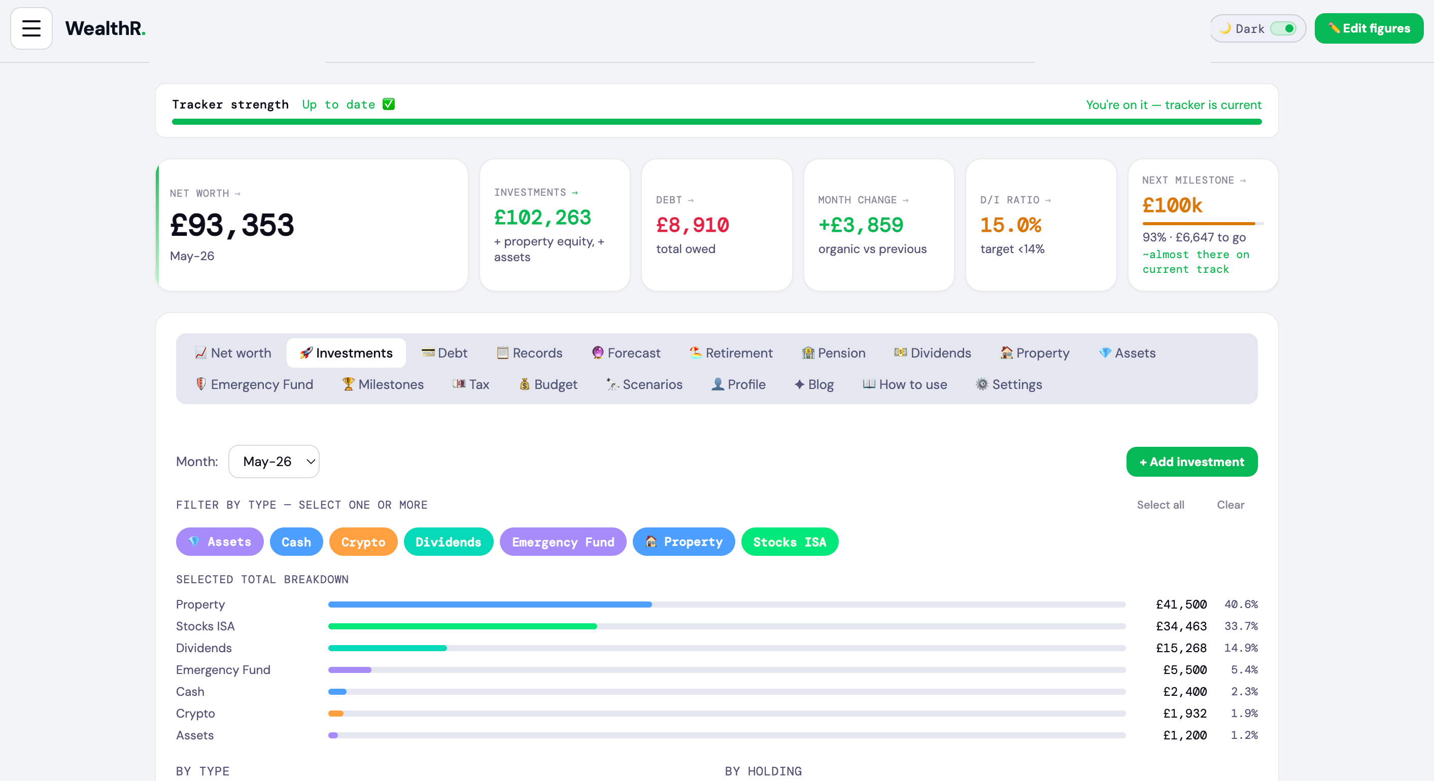
Your net worth is total investments minus total debt. It's the most important number to track — even if it's negative right now, watching it move month by month is the point.
The chart:
Tracked line (solid blue) — your actual net worth, month by month
Realistic line (solid green, hero line) — your headline forecast. Turns amber when it crosses into your retirement years (drawdown phase)
Confidence band (shaded green area) — the range between Pessimistic (red dashed) and Optimistic (purple dashed). Communicates the spread of likely outcomes at a glance
🏖️ Retirement pill — amber marker on the line showing exactly when retirement begins on your forecast
Future milestones — £100k, £250k, £500k, £1M etc. shown as trophy pills where the Realistic line crosses them. Hit milestones show as green chips below the chart instead of cluttering the line.
Hover for detail: mousing over any line shows that scenario's value at that point — the other lines fade so it's easy to read. Tooltip sits below the line so it doesn't collide with milestone pills.
The five metrics at the top:
Net Worth — investments minus debt, right now
Investments — total value of everything you own (ISAs, cash, crypto, pension, property equity etc.)
Debt — total of all debts you have logged
Month change — how much your net worth moved vs last month, in £ and %
D/I ratio — your debt as a percentage of investments. Under 14% is healthy (green), 14–18% is a caution, over 18% needs attention
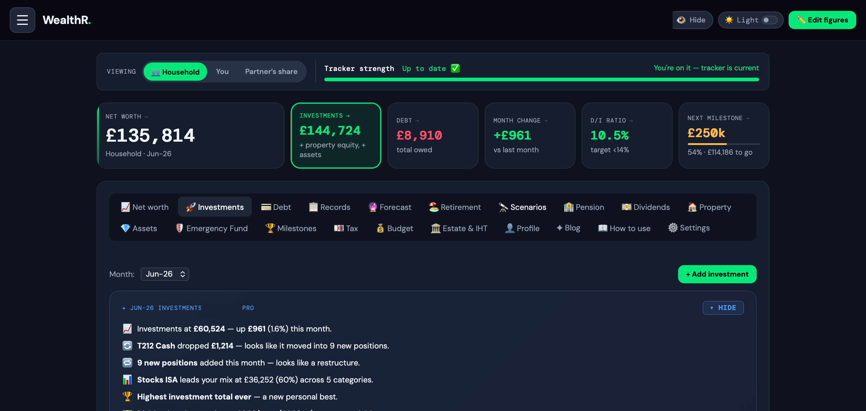
Snapshot card — appears below the metrics with a personalised read of the current month: net worth movement, milestones hit, all-time growth context, FIRE pace and a tracking streak. Pro users get extra lines on personal records, pace projections and savings rate. Tap ▾ Hide to collapse.
Forecast assumptions — pill picker + single adaptive slider directly below the chart. Pick Pessimistic / Realistic / Optimistic or 🎯 Actual (Pro), drag the slider, watch the chart re-flow live.
Below that, the Compounding Effect shows the split between what you have put in vs what compound growth adds on top — including the age where compounding starts outpacing your own contributions.
💡 The monthly debrief card appears after every save — it shows what drove your net worth change, dividend progress, FIRE percentage and any milestones hit that month.
If you share money with a partner, a Household / You / [Partner]'s share switcher appears above these metrics — see the Household & ownership splits section below.
Track money you share with a partner, spouse, friend or family — and see your wealth both as a household and as your own share.
Mark anything as part-owned. When you add or edit an investment, asset, property or debt, set "Your ownership %" — leave it at 100 if it's all yours, or enter 50 for something joint. A "shared with" box then appears so you can name who holds the rest, with a "my partner" tick.
Your net worth always counts only your share of a split holding.
Tick "my partner" and their share counts toward your household total. Leave it unticked for a friend or relative — their share is excluded from your household entirely (it just explains why you only count your slice).
Each split shows a small 👥 pill (e.g. "50% · Partner") on the holding and in the Investments breakdown.
The net-worth lens. Once you have a partner split, a Household / You / [Partner]'s share switcher appears on the net-worth card (and on the mobile Today panel). It re-scales net worth, investments, debt and month change. It only shows when you actually have a partner split, so on your own you never see it.
Plan as a couple. In Profile → "Do you manage money jointly with a partner?", switch on household mode, name your partner and set your usual share. Tick "Plan as a couple" to make the Household view your default. Partner pensions and partner State Pension already feed the outlook (full joint-income forecasting is on the roadmap).
In the Investments breakdown you also get a Value lens (Full / You / Household / Partner's) and a Show filter (All / Shared / Just mine) to slice the charts and table by ownership.
On the Property tab, the same Full / You / Household / Partner lens appears whenever a property is part-owned — it re-scales each holding's value, equity, mortgage, rent and running costs to whoever's share you're viewing, so a home owned 50/50 shows your half under "You" and the whole thing under "Household".
Emergency Fund. On the Emergency Fund tab, tick "Include a partner — cover our whole household" and add their monthly expenses, so your target and months-of-cover reflect both of you.
Tax — plan as a couple. On the Tax tab, enter your partner's salary plus their own pension %, student loan and region. The Calculate view then shows a You / Partner / Combined take-home breakdown and your true household take-home (including Child Benefit after any HICBC clawback). With Pro, the Plan view adds a household pension-efficiency card — it compares both of your marginal rates and tells you which partner should make the next pension contribution, flagging the 60% personal-allowance taper and the higher-rate band, alongside the HICBC-escape and Marriage Allowance checks.
💡 None of this is shared with anyone — it's your private view of how your wealth splits. Ownership defaults to 100%, so if you don't use it, nothing changes.
Tap "+ Add month" (or the + button on mobile) to log your figures. Here's what each field means:
Month & year — select from the dropdowns. Future months are blocked. You can backfill past months at any time.
Investments — add each holding separately (e.g. Vanguard ISA, Santander savings, Freetrade account). Enter the current value, not what you originally invested.
Bought for — what you originally paid for a holding. Optional, but entering it unlocks your real gain/loss and annualised CAGR per holding straight away — visible inside the holding edit modal. (Pro users also get this fed into the Actual Return forecast scenario immediately, instead of waiting for 3 months of tracked snapshots.)
Year purchased — the year you first bought the holding. Combined with "Bought for", this lets WealthR calculate your annualised return (CAGR) per holding.
Regular contribution — set a per-holding contribution amount and frequency (monthly, weekly, or fortnightly). This is for your own reference tracking — the monthly average is shown in the contributions panel inside the entry modal. Your forecast is driven by the single monthly figure in your Profile.
Investment type — Stocks ISA, SIPP, Shares, Crypto, Cash, Emergency Fund, Dividends, Property. Tagging correctly activates the relevant tab and counts towards Emergency Fund automatically.
Debt — each debt with its current balance and optional notes (payoff date, interest rate). Toggle Don't count against net worth on any debt to track it without affecting your net worth figure. You can also add debt directly from the Debt tab.
Assets — tap + Add in investments and select type 💎 Asset to add a physical asset (watch, car, artwork). It saves to the Assets tab automatically.
💡 Set auto-invest amounts on your regular holdings — even if you forget to log a month, your chart stays smooth and your tracking streak stays alive.
The Forecast tab projects your net worth year by year, based on your current investments compounding forward with monthly contributions. Four scenarios are available, each with its own pill:
📉 Pessimistic — bad-sequence years (range -5% to 5%)
📈 Realistic — your baseline (range 1% to 12%, default 7%)
🚀 Optimistic — strong bull markets (range 5% to 15%)
🎯 Actual Return (Pro) — anchored on your real annualised return, slider lets you model what-if values ±5% around it
Pick → drag → watch. Click any pill, the slider re-labels and the range adapts. The chart and year-by-year table update live as you drag. The picker on the Forecast tab and the one on the Net Worth tab share state — change either, both stay in sync.
Scenario assumptions are capped sensibly. Why? At 30%/yr compounded for 30 years the y-axis explodes and everything else becomes unreadable. The caps reflect what diversified portfolios actually deliver over long periods.
Actual return: unlocks via one of two routes — (1) add purchase prices and purchase years to your holdings (available from day one), or (2) log 3 months of real data. Once unlocked, the badge shows your real annualised return — either as a cost basis CAGR or a time-weighted tracked return, with the contribution rate shown so you can sanity-check it.
🛡️ Stress test your plan. A red dashed line on the trajectory chart shows what happens if markets crash. There's an On/Off switch in the panel header — switch it off and the chart, summary and subtitle show your clean base forecast with no crash overlay. Your slider settings are remembered for when you switch it back on. Fully customisable:
Crash magnitude — -5% to -50% (default -30%). Higher = more painful
When it hits — Now / In 5y / In 10y / 5y before retirement / 10y before retirement / Year 1 of retirement / Custom (any number of years)
Recovery rate — 0% to 15%/yr during the recovery window. Low = Japan-style lost decade, high = V-shaped bounce
Recovery duration — 1 to 15 years. Combined with rate, models everything from a sharp snap-back to a 10-year flat grind
The summary text below the chart describes the shape in plain English: e.g. "Stress test result: a 30% crash starting in 7 years leaves you 18% lower than the base case…". The full chart line, summary and impact metric all update live as you drag.
Adjust assumptions panel — the collapsible "🎚️ Adjust assumptions" panel above the table still gives you the detailed three-column editor for fine-tuning per-scenario contributions and debt paydown rates independently. Monthly contributions are linked by default — unlock them to model genuinely different saving rates per scenario.
Planned property disposals — if you've set a planned sale or gift on a property (Property tab → Plan ahead), the forecast applies it in that year: sold equity moves into your investments and keeps compounding; gifted equity (Pro) leaves your net worth. A teal dashed line and pill mark the year on the chart, and the table row gets a matching badge showing the equity amount.
Age filter — use the From/To age inputs to zoom into a specific part of the forecast timeline, like 40–60 or 55–70.
Milestones — below the table, WealthR shows when your current scenario forecasts you hitting each of your net worth milestones.
💡 Your Profile growth rate seeds the Realistic scenario. Changing it in Profile updates the forecast live.
WealthR calculates your actual investment return two ways, and uses whichever is available and most reliable.
Cost basis return (available from day one): if you enter "Bought for" and "Year purchased" on your holdings, WealthR calculates your real CAGR (compound annual growth rate) per holding and a blended portfolio-level figure weighted by what you invested. You see this as a gain/loss insight directly on each holding when editing — free for everyone, no wait required. The Actual Return forecast scenario itself is a Pro feature; on Pro it picks up the cost basis number immediately, so Pro users don't have to wait three months of tracked snapshots to see the scenario.
Tracked return (unlocks after 3 months): once you have 3 months of real logged entries, WealthR uses your actual monthly data points to calculate a time-weighted annualised return. This is the more rigorous method — it tracks real cash flow timing rather than estimated holding periods.
When both are available, WealthR uses the tracked return as it's more accurate. The Forecast dropdown labels which method is active, and both show a badge — cost basis or tracked data — so you always know what the number is based on.
💡 The fastest way to unlock the Actual scenario is to enter purchase prices and years on your holdings when you first set up. One minute of data entry, immediate insight.
The Investments tab breaks down your portfolio for any recorded month — a donut chart by type, a bar chart by holding, and a table with values, percentages and notes.
Use the type filter chips at the top to focus on specific investment types — select one, several or all.
The + Add investment button at the top right opens the monthly entry modal directly, letting you add or update holdings without navigating away.
Each row in the table has an edit button — tap it to update the value, type, auto-invest amount, purchase price or notes for that holding without re-entering everything.
👶 Junior ISA tracker: if you have children, scroll down to the Junior ISA section. Each child gets their own £9,000/year allowance — separate from your adult £20,000 ISA. Tap + Add a child, then enter their name, date of birth (unlocks the age-18 projection), current pot value and monthly contribution. Toggle Include in net worth if you want their pots counted in your household totals. Free tier covers one child; Pro covers unlimited.
💡 Tag investments accurately by type (Stocks ISA, SIPP, GIA, Cash etc.) — it powers the UK-specific breakdown and makes the donut chart genuinely useful.
The Debt tab shows every debt you have logged, with a month picker to see your position at any point in time.
Use the + Add debt button at the top right to add a debt directly — no need to open the full monthly entry modal. Enter the name, balance and optional notes (e.g. interest rate, 0% end date, payoff target). It's added to the current month automatically.
The D/I ratio is the key number — for every £100 you have invested, how much do you owe? Under 14% is healthy. Over 18% means debt is a significant drag on your wealth building.
Mortgage debt toggle: if you have a property with a mortgage, a toggle appears at the top. By default mortgages are excluded from the debt total — because property equity already offsets it in your net worth. You can override this at any time.
💡 Add notes to each debt with the payoff date. Watching debts disappear month by month is one of the most satisfying things in the app.
The Retirement tab answers one question: at your current rate of saving, when can you stop working? Adjust the sliders to see how different choices change the timeline.
Retirement target — the total pot you need. Calculated as your target annual income divided by your withdrawal rate (default 4%). Want £30k/year? You need £750k.
Years until you get there — at your current saving rate and growth. More contribution or higher returns = smaller number.
How far along you are — your current pot as a percentage of your target. Watch this grow month by month.
Coast number — the pot size where you could stop saving entirely. Compound growth alone would carry you to your target by your chosen retirement age. Hit this and your money works harder than you do.
The Living off your pot chart shows what happens in retirement — your pot declining as you draw it down. If the line hits zero, adjust the sliders. A well-structured plan keeps the line above zero well past your expected lifespan.
💡 The 4% rule has held over 30-year retirements historically. Planning to retire before 55? Drop it to 3–3.5% to account for a longer drawdown period.
The Pension tab brings all your pension pots together — alongside your UK State Pension projection and a tax relief breakdown. It's separate from general investments because pensions have their own rules, types and tax treatment.
Pension types:
Defined Contribution (DC) Workplace — most common. You and your employer both pay in. The pot is invested and grows. You get whatever it's worth at retirement.
SIPP — Self-Invested Personal Pension. You control the investments. Popular with the self-employed and anyone wanting full flexibility. Government adds tax relief automatically.
Defined Benefit (Final Salary) — guarantees a set income based on salary and years of service. Common in the NHS, civil service and teaching. Your employer carries all the investment risk.
Lifetime ISA (LISA) — save up to £4,000/year, get a 25% government bonus (£1,000/year). Can be used for a first home or retirement from age 60.
State Pension: enter your qualifying NI years and expected future years. WealthR projects your weekly and annual State Pension — you need 10 years minimum for any payout, 35 years for the full amount. Check your NI record at gov.uk — WealthR uses the current tax year rate automatically.
Tax relief: for DC pensions, WealthR shows what contributions cost you after relief. Basic rate: 20% back. Higher rate: 40% back (claim the extra 20% via Self Assessment).
💡 The projected retirement income figure combines your DC pot drawdown and State Pension — your total estimated annual income in retirement.
The Dividends tab models two phases of dividend investing — reinvesting (DRIP) while you build, then switching to income when you're ready. A collapsible guide at the top of the tab covers what dividends are, UK tax treatment, DRIP compounding and what to consider holding.
To activate the tracker: add a holding with type Dividends in the monthly entry modal, or use the + Add holding button directly on the tab. Enter the annual yield % (e.g. 4.5%), account wrapper (ISA, SIPP, GIA), frequency and strategy.
Building phase — dividends are reinvested, compounding your portfolio as fast as possible
Income phase — dividends are paid as monthly income. Drag the age slider to set when you switch.
Age lookup — type any age to instantly see projected monthly and annual income at that point
UK dividend allowance: £500/year tax-free (2026/27). ISA and SIPP wrappers are fully sheltered. GIA holdings above the allowance are taxed at 8.75% (basic rate) or 33.75% (higher rate). The allowance has been cut three times in four years — plan accordingly.
💡 All figures are pre-tax estimates. Dividend income and capital growth are not guaranteed.
Tag any investment as Property to activate the Property tab. Three types are supported:
Primary residence — tracks value, outstanding mortgage and equity month by month
Buy to let (BTL) — tracks rental income, mortgage, running costs and net monthly cashflow. Gross yield calculated automatically.
Holiday home — same as BTL when renting out
The equity growth chart projects each property 30 years forward — mortgage balance reduces monthly and property value appreciates, so equity grows dynamically rather than as a flat number.
Selling or removing: tap 🏷 Sell / Delete. You can allocate the proceeds to investments, record them as 🎁 gifted to family (Pro — logs a lifetime gift in the Estate & IHT tab, starts the 7-year clock, and can split equally between named beneficiaries), log it as funds moved elsewhere, or remove the record entirely. The Activity Log lets you restore it. Selling a rented-out or second property can trigger Capital Gains Tax (due within 60 days) — the sell screen links to the free CGT calculator.
Property equity can be toggled in or out of your net worth and forecast at any time.
📅 Plan a future sale or gift: each property card has a "Plan ahead" row — pick a year and what happens to the equity. Sell & reinvest moves the equity into your investments in that year of the Forecast; gift to family (Pro) removes it from your net worth entirely, so you can see the step-down before you commit. Either way the Forecast chart and table get a teal marker — "🏷 Flat sold 2028" or "🎁 Flat gifted 2028". It's a model, not an action: when the sale actually happens, use Sell / Delete as normal (and the gift option there starts the real 7-year clock).
Mortgage deal reminders: add your interest rate, mortgage type and deal expiry date to each property. WealthR shows an amber warning when your deal is within 90 days of expiring, and a red alert if it has already expired — giving you time to shop around before rolling onto SVR.
💡 A collapsible guide at the top of the Property tab covers owning vs renting, BTL reality, alternatives — and a full explanation of Fixed, Tracker and SVR mortgage types including when to act.
✦ Free tier: 1 property. WealthR Pro: unlimited properties — track multiple BTLs, holiday homes and your primary residence side by side.
The Estate & IHT tab builds your inheritance tax picture from the data you already track — no re-keying. It needs at least one logged month (or a pension pot) to work from.
Your situation — five quick settings shape the whole calculation:
Marital status — assets left to a spouse or civil partner are IHT-free; the tab models the combined estate on the second death
Both partners' allowances — a surviving partner can usually use both sets of allowances: up to £650k nil-rate band + £350k residence band = £1m before IHT
Home to children / grandchildren — qualifies you for the residence nil-rate band (£175k, tapered £1 per £2 above a £2m estate)
Include pensions? — toggle the April 2027 rule on or off and see both versions: under the new rule, unused DC pension pots join your estate
Charity — leaving 10%+ of your estate to charity cuts the IHT rate from 40% to 36%
The calculation — estate value → allowances → taxable estate → IHT due → what passes to your heirs. Every line is shown, so you can follow the maths. Physical assets and excluded property equity still count for IHT even when toggled out of your net worth — the tab handles that automatically.
✦ Free tier: the full IHT calculation above. WealthR Pro adds the planning suite:
🎁 Lifetime gifts — 7-year rule — record larger gifts (above the £3,000 annual exemption), backdating supported. Each gift gets a live 7-year countdown with taper relief applied between years 3 and 7, and an estimated IHT figure if you died today. Survive a gift by 7 years and it falls out of your estate entirely.
📋 Wishes — who receives what — name beneficiaries, earmark specific assets to people, set each person's share of the estate, and see per-person totals across gifts, assets and estate share — including a fairness check between children. Wishes have their own privacy switch: they stay out of PDFs, printouts and adviser views unless you explicitly set them to Shared.
🕊️ If you died today — what your family receives from each pension: death-in-service lump sums (often 3× salary), survivor's pensions from DB schemes, and DC pots passing to nominated beneficiaries — with the correct IHT treatment under both the current and April 2027 rules. A reminder worth repeating: schemes pay out guided by your nomination forms, not your will.
Selling a property and gifting the proceeds (Pro): when you tap 🏷 Sell / Delete on a property, choose "🎁 Gifted to family" — the proceeds are recorded as a lifetime gift here automatically, with the 7-year clock started. Tick more than one beneficiary and the gift splits equally, each share with its own clock. Anything kept back is added to your portfolio as cash.
💡 Everything in this tab uses current UK rules — 2026/27 bands, frozen until 2030 — and is an estimate, not advice. Inheritance tax and estate decisions are exactly the conversations to take to a qualified adviser or solicitor; the Print / PDF report is designed to bring with you.
The Assets tab tracks physical assets that hold or grow in value — things that don't fit a traditional investment account. Always visible in the navigation.
⌚ Watches & Jewellery — luxury items with secondary market value
🎨 Art & Collectables — paintings, rare items, trading cards
For each asset, WealthR calculates gain/loss vs purchase price, annualised return (based on purchase date), net position after holding costs, and a future value projection based on your expected annual change rate.
Assets default to excluded from net worth — toggle them in if you want them counted. Physical assets are real wealth but illiquid, so the choice is yours.
To add quickly: use + Add month → tap + Add in Investments → select type 💎 Asset.
💡 A collapsible guide at the top of the Assets tab covers gold, watches, classic cars and art — what has historically appreciated and what hasn't.
✦ Free tier: 1 asset. WealthR Pro: unlimited assets — track watches, gold, art, classic cars and more all together.
Milestones tracks your progress towards key net worth targets — £10k, £25k, £50k, £100k, £250k, £500k and £1M. Each shows a progress bar, how close you are, and when your Realistic forecast says you will get there.
Add custom milestones for personal goals — a house deposit, a sabbatical fund, paying off a specific debt, anything that matters to you.
On the chart:
Future milestones appear as trophy pills on the Realistic line at the projected crossing point, with a faint dashed horizontal at the target value
Achieved milestones are kept off the chart line and shown instead as a green chip row beneath the chart (✓ £10k, ✓ £25k, ✓ £50k…) — clean, celebratory, doesn't clutter the live forecast
When you hit a milestone, a celebration also appears in your monthly debrief.
Every time you save a monthly entry, WealthR generates a personalised debrief card that slides up from the bottom. It shows:
Net worth movement — how much you gained or lost vs last month, and whether it's your best month ever
What drove the change — which category accounted for the biggest chunk. If the top category moved against the overall direction (e.g. Stocks ISA up while other categories fell), the phrasing flips to "X grew £Y — more than offsetting £Z of declines elsewhere"
Dividend income — your projected monthly passive income and how it moved
FIRE progress — your current percentage toward your retirement target
Milestones hit — any net worth thresholds crossed this month
Tracking streak — how many consecutive months you have logged
Live snapshots on Net Worth and Investments tabs. Beyond the post-save debrief, WealthR shows a "snapshot" card on both tabs that updates live as you switch months. The Investments snapshot is particularly rich:
Top mover by name — calls out the specific holding (e.g. "Emerging Markets Shares led the way — +£5,975 on its own")
Restructure detection — flags when you add multiple new positions in a month ("9 new positions added this month — looks like a restructure")
Rotation detection — when cash drops and a new holding appears, flags as a transfer not a loss ("T212 Cash dropped £1,214 — looks like it moved into Novo Nordisk")
Personal records (Pro) — "Highest investment total ever" / "Your biggest growth month on record"
Milestone bands (Pro) — "First month above £75k in investments" fires on the month it happens
Pace projection (Pro) — "At your current pace, you'll cross £100k in 14 months"
Dividend pace (Pro) — annualised dividend income at current yields
Free users see the core snapshot lines; Pro lines appear blurred with a click-to-unlock hint. Tap ▾ Hide on either snapshot to collapse it — state persists per user.
Your emergency fund is money set aside for the unexpected — job loss, car repairs, medical bills. Without one you are forced to sell investments at the wrong time or take on debt.
WealthR automatically counts your Cash and Emergency Fund investments towards your target — just tag investments with those types when logging.
How to set it up: go to the Emergency Fund tab, enter your monthly expenses and choose a target (3 months is the minimum, 6 months is solid). WealthR shows how many months of cover you have now and how long until you're fully funded.
💡 A commonly cited guideline is 3–6 months of expenses in an accessible account — the right amount varies by individual.
Your Profile settings power the whole app:
Date of birth — your age is calculated automatically everywhere. You never enter it manually.
Target retirement age — used in Retirement, Dividends horizon and your forecast timeline
Retirement target 🎯 — the pot size where your investments cover your lifestyle. Multiply annual expenses by 25 as a starting estimate (£30k/yr = £750k target)
Monthly contribution — how much you typically invest each month. Drives forecast accuracy, auto-fills missing months, and seeds the Scenarios panel. Update it here and all three scenario contributions update automatically.
🎯 Auto-fill allocation — below the contribution field, a card shows exactly how your £X/mo splits across your holdings during missed-month auto-fill. Tap Customise → to open a table with every holding and its planned share. Edit any amount (£ or %) to lock that holding's allocation, leave blank for an equal share of the remainder, or toggle a holding off to exclude it entirely. Property is excluded by default — it has its own mortgage logic.
Expected growth rate — your annual return assumption. 7–8% is typical for a diversified global index fund. Changing this live updates the Realistic scenario immediately. A "Go to Scenarios →" link appears under the field to take you straight to the forecast panel.
💡 Keep your contribution and growth rate accurate — even small changes have large long-term effects on your forecast.
The Compounding Effect chart sits on the Net Worth tab and shows the most important concept in investing — the split between what you put in and what compounding adds on top.
Blue bars — your total contributions (every pound you have personally invested)
Green bars — what compound growth adds on top. Money you did not earn — it appeared.
The age slider — drag to any age and watch the bars grow in real time
Crossover point — the age where compounding starts adding more per year than your contributions. After this, money works harder than you do.
Growth rate — adjust your expected annual return directly on the chart. Hit "Save to profile" to make it permanent.
💡 The earlier the crossover, the more powerful your position. Even a modest increase in monthly contributions moves it significantly.
The History tab has two sub-tabs:
Records — full table of every month you have recorded, with net worth, investments, debt, D/I ratio and change. Edit or delete any entry.
Activity log — a full audit trail of every edit and deletion. If you accidentally delete an investment, find it here and tap ↩ Revert to restore it instantly.
Auto-estimated months (filled by auto-invest) show a ✱ — tap edit to replace with your real figures at any time.
💡 Deleting a month removes all its investments and debts. The Activity Log lets you get it back if you change your mind.
Generate a read-only share link from the Profile → Settings tab. Before the link is created, you choose exactly which sections it shows — tick Net worth and Forecast for your IFA, just Pensions for an accountant, or a fuller picture for family. Everything you don't tick simply doesn't exist in their view, and they cannot edit anything.
Share it with your IFA, accountant, financial coach or a trusted family member. They get the picture you've chosen to give them, instantly. Most advisers are impressed — the majority of clients cannot tell them their actual net worth on the spot.
Regenerate the link with a different selection any time, or revoke it with one click — the old link immediately stops working. Links also expire automatically 30 days after creation, so an old link you forgot about can't stay live forever.
Estate wishes have their own privacy switch on top of this: even when the Estate & IHT section is shared, who-gets-what stays hidden unless you've explicitly set wishes to "Shared".
💡 The share link contains no personal identifiers — just the financial data you selected. No name, no email, no account details are exposed.
✦ WealthR Pro feature. Custom share links are part of Pro — perfect for clients working with an IFA or accountant.
The Tax tab is a UK income tax calculator for the current tax year. It's a standalone illustration tool — nothing you enter here affects your investments, forecasts or net worth. It's designed to help you understand where your money goes and surface things worth knowing about your tax position.
What it calculates: income tax (broken down band by band using England/Wales/NI or Scottish rates), National Insurance, student loan repayments (Plans 1, 2, 4, 5 and Postgraduate), pension contributions (employee and employer), and your annual and monthly take-home pay.
Smart observations: based on your inputs, WealthR surfaces contextual facts — not advice. These include the 60% effective rate trap (£100k–£125,140), child benefit taper (£60k–£80k), salary sacrifice opportunities, marriage allowance eligibility, ISA annual allowance and pension annual allowance warnings (including the taper for high earners above £260k).
Scotland vs England: Scotland has its own bands — Starter (19%), Basic (20%), Intermediate (21%), Higher (42%), Advanced (45%) and Top (48%). Select your region and the correct rates apply automatically.
Print report: tap "Download / print summary" to open a clean one-page tax summary. Use your browser's "Save as PDF" to download it — useful before a meeting with an IFA or accountant.
Your inputs are saved and pre-fill automatically next time you visit.
✦ Pro: Tax Year Optimiser. Pro users unlock a personalised action plan that turns the smart observations into concrete moves — the HICBC escape calculator works out the exact pension contribution to recover Child Benefit, the Marriage Allowance scanner flags the £252 saving when eligible, Move-into-ISA (Bed and ISA) candidates identify GIA holdings to shelter, plus salary sacrifice savings to dodge the 60% trap and pension annual allowance taper warnings. Every action is ranked by £ saved with a printable plan to take to your adviser.
⚖️ This tool uses standard tax rates for illustration only. It does not constitute financial or tax advice. For your specific situation, speak to a qualified tax adviser.
The Budget tab is your monthly bill planner. Enter your essential outgoings by category — housing, transport, groceries, utilities, subscriptions, childcare, debt payments — and WealthR shows exactly what's left after everything goes out. Your savings rate appears in real time with smart observations on how it compares to UK norms.
How it works: set your monthly take-home (or auto-import from the Tax tab) and add each bill by category. The remaining amount and savings rate update live as you type. A coloured indicator on each category tells you whether you're in the typical range for that line, on the light side, or on the heavy side.
Housing share slider: if you split rent or mortgage with a partner or flatmates, set your share (100%, 75%, 50%, 25%). The tab uses your effective share rather than the full property cost — keeps the figures honest if you're not paying the whole thing.
Smart observations — based on your figures, WealthR surfaces context not advice: savings rate vs UK average, ISA headroom you have available, salary sacrifice opportunities if you're near a tax band, and how your monthly surplus connects to your FIRE date.
Powers other features: your bills figure feeds the Income Shock scenario (for runway calculations), the Emergency Fund target (months of expenses cover), and your overall savings-rate analysis. Worth keeping up to date — a lot of other tabs lean on it.
💡 The mobile layout stacks the category rows into a clean two-line card (icon left, label + input full-width below) so big amount entries fit comfortably on a phone keyboard.
Scenarios is WealthR's life-event simulator. It answers the questions a financial planner would charge £200/hr to model — but in your pocket, against your actual data. Drag a slider, see the consequence on your net worth trajectory, FIRE date and lifetime wealth in real time.
What you can model today:
💼 Income Shock (free taster): what happens if your income stops? Drag two sliders — loss percentage (0–100%) and duration (1–36 months). The chart, outcome cards and 3-sentence narrative update live. See your runway in months, FIRE-date delay and lifetime cost. The cost is broken down transparently: income lost during the shock + growth foregone (the surplus that would have compounded). All assumptions (annual income, expenses, growth rate) are visible and editable at the top — override any of them if your reality differs from the figures pulled from your Tax + Budget tabs.
👶 Cost of Raising a Child (Pro): anchored on the Child Poverty Action Group's annual Cost of a Child report. Three controls — number of children (1–4), child's current age (0–17), and education path (state / private from 11+ / private throughout). Plus a separate Childcare arrangement chip: Family help/WFH (~£500/yr), part-time formal (~£4.5k/yr), full-time formal (~£9k/yr), or Custom £ where you type your actual monthly cost. Excludes housing (your property is already tracked elsewhere) and university support.
Coming next:
🏥 Long-term Care (Pro): models the impact of needing residential or in-home care from any age — typical UK costs are £35k–80k/year — and shows what's left of your retirement pot and residual estate. Pairs with your IHT-on-pensions tool.
🔄 Single-Income Transition (Pro): deliberately neutral framing for any period where your household drops to one income — partner illness, career break, divorce, parental leave. Focuses on the financial impact, not the circumstance.
How each scenario works: the engine takes a snapshot of your current state (net worth, income, bills, growth assumptions, retirement target) and applies a perturbation to project forward. The dual-line chart shows your baseline trajectory (dashed grey) versus the scenario (solid green). The shaded area between is literally the cost of the scenario. Outcome cards summarise the headline numbers; sliders let you experiment; the narrative explains in plain English what it all means.
Quick presets above the sliders jump you to common life situations in one tap — Redundancy / Parental leave / Long illness for income shock; 1-child state / 2-kids state / private secondary for child cost.
💾 Save & Compare (Pro): save a scenario configuration with a name (e.g. "My redundancy plan", "2-kid private school stretch"). Saved scenarios appear on the Scenarios overview as cards — tap to re-open them at the exact settings, tap Compare to overlay two side-by-side. The compare view shows both trajectories on one chart plus a table of deltas (FIRE date impact, lifetime wealth impact). Saved scenarios sync across all your devices via the same Supabase pipeline that handles the rest of your data.
💡 Saved scenarios update their figures dynamically as your underlying data changes — they're configurations, not snapshots. If your emergency fund grows from £5k to £8k, your "Redundancy plan" automatically reflects the longer runway next time you open it. No manual refresh needed.
✦ Pro feature. Income Shock has a fully-functional free taster so you can try the experience; the other scenarios, save and compare, and longer slider ranges unlock with WealthR Pro.
⚖️ Scenarios are projections from your current data using standard assumptions — not predictions, not financial advice. For decisions that matter, talk to a regulated adviser via Unbiased.
WealthR automatically saves to the cloud every time you log an entry. You will see a ☁ synced indicator in the top bar when everything is up to date.
Sign in on any device — phone, tablet, laptop — and your data loads automatically. Nothing to transfer or export.
Installing on iOS: open WealthR in Safari → tap the Share button → "Add to Home Screen". It launches as a full-screen app with no browser address bar or navigation chrome — exactly like a native app.
Installing on Android: open WealthR in Chrome → tap the three-dot menu → "Add to Home Screen" or "Install app". Same experience.
The installed version respects your phone's safe area (Dynamic Island, notch, home indicator) and handles landscape/portrait correctly. It's the best way to use WealthR on a phone.
💡 Tour seen status, scenario settings and profile preferences all sync across devices — so your setup follows you everywhere.
The WealthR Blog is a growing collection of practical UK personal finance guides — written from experience, no jargon, no advice.
Current posts cover net worth tracking, ISA vs SIPP, retirement planning and why starting young matters. New posts are added regularly on topics that matter to UK investors.
Access the blog from the ✦ Blog tab in the sidebar, or visit wealthr.co.uk/blog directly. Every post links back to the relevant section of the app so you can put what you read into practice straight away.
💡 The blog is the best place to understand the thinking behind WealthR's features — if you want to know why the 25x rule matters or how to think about ISA vs SIPP for your situation, start there.
WealthR's free tier covers the fundamentals — net worth tracking, forecasts, debt, retirement, dividends, tax calculator, budget planner, one property, one asset and one Junior ISA child. Pro unlocks the planning tools that turn tracking into action.
What you get with Pro:
🔭 Scenarios — life-event simulator — model an income shock, the full cost of raising a child (with childcare arrangement and education path inputs), long-term care, a single-income transition, a car-on-finance decision, or the 2026–2031 UK Budget changes. Drag sliders, see runway / FIRE delay / lifetime cost update live with a transparent cost breakdown. 💾 Save & Compare lets you save configurations with names, compare two side-by-side, all synced across devices. The £200/hr financial-planner experience for £4.99/mo.
🏛️ Estate planning suite — the Estate & IHT tab's full IHT calculation is free; Pro adds lifetime gift tracking with live 7-year countdowns and taper relief, who-gets-what wishes with per-person totals and a privacy switch, the "if you died today" death-benefit view, and handing gifted property-sale proceeds to named beneficiaries split equally.
🧠 Tax Year Optimiser — a personalised action plan with quantified £ savings: HICBC escape calculator, Marriage Allowance scanner, Move-into-ISA (Bed and ISA) candidates, 60% trap mitigation, pension annual allowance taper warnings. Printable to take to your adviser.
🔗 Custom adviser & family share links — read-only links showing only the sections you tick. Different selections for your IFA, accountant or family. Revoke anytime.
📄 PDF reports — full one-page financial summary you can save, print or email.
🎯 Actual Return scenario — fourth scenario pill anchored on your real annualised return (from purchase prices or 3+ months of tracked data). Slider lets you model what-if scenarios ±5% around your actual to explore "what if the next decade averages higher/lower than my recent return?".
🏠 Unlimited properties — track multiple BTLs, holiday homes and your primary residence side by side.
💎 Unlimited assets — every watch, gold bar, classic car or piece of art counted alongside your investments.
👶 Unlimited Junior ISA children — track every child's £9,000/year allowance separately.
🗂 Unlimited history — keep every month you've ever logged with no cap.
Pricing: £4.99/month or £39.99/year (saves ~£20). 7-day free trial for first-time subscribers — full access, cancel anytime in Settings, no charge if you cancel before the trial ends.
✦ Upgrade from Profile → Settings → Upgrade to Pro, or tap any Pro feature to start the trial. Existing data, settings and history are preserved — Pro just unlocks the gated features instantly.
💡 Pro is designed to pay for itself. The Tax Year Optimiser alone typically surfaces several hundred pounds of legitimate tax savings for higher-rate earners — far more than the annual subscription.
Change password
Choose a strong password — at least 8 characters with a mix of capitals, numbers or symbols.
Use 8+ characters with a mix of capitals, numbers or symbols.
🎉
You're in!
Your financial picture is live. Want a quick 2-minute walkthrough of what everything does?
Edit milestone
Contact support
Got a question, found a bug, or just want to say hi? Send us a message and we'll get back to you.
✓
You're already on the list.
You'll get the monthly nudge to log your latest numbers, plus any new free UK tools or money-rule changes worth a look. Unsubscribe any time from any email — or from Settings.
Step 1 of 13
📈
Add WealthR to your home screen
Instant access. No App Store. No credit card.
Runs as a full-screen app — no browser bar, launches straight from your home screen.
1
Tap the Share button ⬆️ at the bottom of Safari
2
Scroll down and tap Add to Home Screen➕
3
Tap Add in the top right — done ✓
Installs in one tap. Runs as a full-screen app with no browser bar.
✦ Monthly debrief
March 2026
✦ Feedback
Tell me what you think.
Feature idea, bug report, or just a thought — I read every message personally.
Confirm delete
↩ You can revert this from the Activity Log in the Records tab.
Edit debt
🎯 Customise auto-fill allocation
Edit investment
Include in monthly auto-fill
When ON, this holding receives a share of your monthly contribution and grows at your assumed rate when months are auto-filled. Set autoContrib above for a specific amount, or leave blank to share equally.
👥 shared with
📊 Purchase history
💸 Fund / platform fee
Ongoing charge figure (OCF) or total expense ratio (TER) — taken automatically from returns each year. Typical index funds: 0.07–0.22%. Active funds: 0.5–1.5%. Platform fees are separate and can be added in Notes.
💵 Dividend details
₿ Live price
🏠 Purchase history
Edit dividend holding
£
£
Edit property
£
£
£
£
Your current fixed or tracker rate
For reminder only — WealthR will alert you before your deal expires so you can shop around before rolling onto SVR
£
£
Add my figures
✨ These are sample figures to get you started. Just overwrite any one with your own and hit Save — you don't have to fill in everything. The samples disappear the moment you save your first real number.
📈Investments
🏦Have a SIPP or workplace pension? Track it in the instead — it captures tax relief, employer contributions and access-age rules.
💳Debt
Summary
Investments
£0
Debt
£4,860
Net worth
£0
📄 Download PDF
⚖️
For personal use only
This summary contains your personal financial data. If you're sharing it with a financial adviser, accountant or similar — that's exactly what it's designed for. Just make sure you trust who you're sending it to.
⚖️ All figures are for illustration only and do not constitute financial, investment or tax advice.
Stay in the loop? 📬
A short email about once a month — a nudge to keep your figures up to date, plus any new tools worth a look for you. No spam, and you can unsubscribe in one tap anytime.
Confirm action
To confirm, please tick the box below:
Then type DELETE to proceed:
Update value
£
💎 Edit asset
🏠 Remove property
Have you sold this property? What would you like to do with the proceeds?